

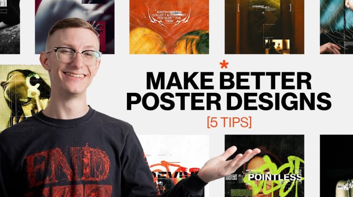
posters are a great way to hone your skills and explore new designs and techniques I know me personally designing posters has really helped my career it's given me a safe place that I can try things out I can fail and then I can even express my own ideas and thoughts and from the many poster designs that I've made throughout the years 710 in counting I've discovered a number of different techniques ideas and principles that I think anybody could take and apply to their designs and while there are many tips that I could probably bring up I figured five would be a good number and I think these are kind of the main ones that make a huge impact on the designs that I do so the first tip that I want to talk about is using the camera raw filter now the camera raw filter is an effect in Photoshop that I feel like doesn't really get utilized all that much even though it can be a really powerful tool I personally like to use it whenever I'm finished with the design and I'm trying to make sure all the colors align a little bit better than how they had before so something that I might do is whenever I'm finished with the design I'll merge all of the layers into One Singular layer at the very top and I'll turn it into a smart object so I can then apply the camera raw filter that way I can always go back to the original if I need to make some tweaks and I'll still be able to save all the settings and any of the changes that I make that are applied with the camera raw filter so the first thing that you could tweak is the exposure so you can mess with things like the highlights the Shadows the blacks the whites just kind of dialing in the exposure for the entire image you could think of it like applying a filter over the entire thing so if you have some disjointed photography it might help kind of bring them all to a more cohesive look but for me personally what I really use this for is the colors so in the camer off filter there should be a section that's called the color mixer I'll start with adjusting the Hues just trying to make some slight tweaks trying to make sure that I'm pushing the colors in a direction that I like more and then I'll move on to saturation and luminance now you could be as drastic or subtle as you like but really the idea is just to tweak the colors just so they make a little bit more sense with the design that you've made because a lot of the times whoever made the photograph that you're using probably didn't really have your design mind so it might not actually really work out that well but if you're able to shift the colors a little bit it can help pull it into the direction that you're going I use this a lot especially whenever I'm dealing with anything that has a blue sky I feel like a lot of the times the blue tends to be a little bit more purple maybe too blue and I actually like to make it a little bit more teal add in some more of that kind of greenish color I feel like that works a little bit better especially because I use a lot of orange and those have some really good contrasting colors but of course it's all going to depend on the look that you're going for because maybe the photo that you're using is maybe a little bit more orange and you want it to be a little bit more yellow and so the camera filter is a great way to kind of select the very specific colors that you're looking at and then shift them in the direction that you need but with that being said if your design is bad this tip is not going to save it but if you do have some great design and you do have some great photography this can definitely help make it just a little bit better than it was before you know you're going from a 9 to a 10 and just a secondary tip that goes along with this you can also use the ls that are built inside of Photoshop which kind of do a similar thing but you don't have as much control control but there are a lot of great options so if you're just trying to make all of your photos feel a little bit more cohesive you can definitely try out using some of the Photoshop Bloods now the second tip that I have for you is to design in black and white now this is especially for anybody who does a lot of typography or layout work it's really easy to get caught up in colors and photography and a bunch of stuff that doesn't really matter and then you end up forgetting about the layout and the composition so what I might recommend and it's something that I do occasionally is instead of worrying about all that I'll just design in grayscale I'll have a black background I'll use white text and then if I need to think about where I'm going to put images I'll use a gray box and this is really helpful for focusing on the layout and the composition because you're not worrying about everything else it's just the composition and just the layout and what I can say for sure is if you have an exciting layout that's in Black and White Once you add in the photos it's just going to get better but it doesn't always work the other way around it's very similar to how most people design logos they design it for black and white and if it looks good in black and white it's going to look even better in color so if you're looking for a challenge or maybe you're wanting to improve your layout and composition skills I think this is a great tip for you now the third tip that I have is to break the grid now if you're not familiar many designers use grids in their design in order to organize and lay out different information this can lead to some really simple and Powerful designs but sometimes it can get a little bit boring and a little bit monotonous so what I like to do if I'm working on something that's heavily grid based is to find one thing that is not a part of the grid so let's say for instance you you have a poster design it's laid out very well all the type is in neat boxes and it looks very clean but it might be a little bit boring so you know maybe what you do is you add a shape or a subject or an image that breaks out of the grid so maybe that's a snake that's slivering off the page or maybe you have a photograph in a square container and you find just one part of that image to poke out from that square it helps break up the monotony of everything just being in a square it can add in some unique or organic shapes that can help Shake Up Your Design now the fourth tip that I have for you is to push ideas to their absolute limit now this is for people who really want to make a statement with their design it requires some courage but it also requires a little bit of caution for instance it can be really powerful to take really big type and maybe move it a little bit off the page so you're cutting off the bottoms of the letters on the other hand it can cause some legibility issues so depending on your intention with the design this could be a good or bad thing so what I like to do is take it as far as I can possibly go with it and then take one step back especially when it comes to stuff like typography because like I said if you want it to be legible then you have to make some compromises but that doesn't mean that you still can't push it as far as it can go and while I've been talking specifically about typography you could apply this to just about anything else you know maybe it's blowing up photography or stretching photography maybe it's the size of different objects that you're using or where you're placing the photography or maybe you're stretching typography out and you're trying to see how tall you can make the letter forms of course there's lots of different ways that you can apply this principle but really you're just trying to push something as far as it can go and then take one little step back I can't gain guarantee that the results are always going to be what you expect but what I do know is it's going to lead to something interesting sometimes it'll be good sometimes it'll be bad but the good thing is you're learning as you do it and you'll be gaining some new tools that you can use on each project so don't be afraid of seeing how far you can push something that you're using in your designs now the fifth and final tip is actually my favorite so very similar to the first design what I like to do is to merge my entire project into one layer technically you can do this at any point of your design but I just like to do it at the end now with the entire design of one layer what I like to do is I like to just kind of experiment with it I'll blow it up I'll move it around I'll chop it up you know just try something out and see what happens you'd be surprised on the type of things that you can come up with whenever you try this out I especially like this if I'm looking for some interesting layouts I think a good example would be this design that I made recently as is I thought it was a good design but I just wanted to explore something new and see what else I could come up with so just like I said I put the entire project into one layer so that way I can just kind of move it around and just see what happens so from that I landed on this idea of having just part of the original design that's peeking through on the side and then you have the more blown up version that's taking up more of the space which was cool but I was like yeah maybe there's something else that I could do so I made another copy just to see what else I could come up with especially because in this image there's a ballerina and I wanted to make sure that you could still see her at least a little bit so I started playing around with it again and then I landed here with another version of it repeating or things overlaying on top of each other the only thing was I was missing some of the typography so I just masked that out so you could see the typography and the result was even more interesting than it was before I didn't have to tweak my old design I didn't have to go back through and change things it was the same design that I had already finished with I just kind of explored some different options with it it was really simple a lot of fun and the results can be really surprising so again take your final design and mess around with it there's lots of ways that you can use this design so just take it and have some fun with it so hopefully these tips will give you some new ways and some new ideas to approach your designs with really I just want to encourage everybody to try something new and get creative use the tips that I've given you combine them twist them and make them your own just do something different and have fun with it but if you did find this video helpful I would appreciate it if you would check out the rest of my channel and then consider subscribing I hope to see you in the next video